BLOOMINE

Concept of brand design project

Bloomine is a company selling cosmetic skin care products for youth. With it’s original and nostalgic design this brand targets on young people. The main reason of creting this project was to reduce young people using expensive anti-aging skincare products they might be damaging their skin with.

Used software
cmyk
(39,26,0,1)
rgb
(155,186,253)
hsl
(221,96%,80%)
#9BBAFD
cmyk
(0,54,71,0)
rgb
(255,117,74)
hsl
(14,100%,65%)
#FF754A
cmyk
(16,0,49,5)
rgb
(203,241,123)
hsl
(79,81%,71%)
#CBF17B
cmyk
(0,9,18,0)
rgb
(255,232,210)
hsl
(29,100%,91%)
#FFE8D2
cmyk
(0,0,0,88)
rgb
(31,31,31)
hsl
(0,0%,12%)
#1F1F1F

PROJECT BRIEF

Bloomine is a skin care cosmetics brand selling products made of natural ingredients suitable for younger skin.

Project brief for this brand identity started with the idea to solve a worldwide problem with young children purchasing expensive anti-aging skin care products that might be causing great damage to their young skin. Creating this brand should attract younger audience to purchase non-harmful skin care products.

With a lot of brainstorming and project briefing I came up with the specific design idea I wanted to use for this brand identity project.

Color palettes
Design research
Marketing research
Brand name
Font pairings
Primary logo
Sketching
Brainstorming
Element creating
Design thinking

LOGO SKETCHING

Logo is an element representing the brand as a whole. So it’s really important to set a process of creating a strong, storytelling logo in 2 or more variations for a good usability across all different media.

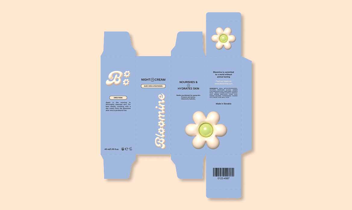
For this project I decided to combine a ‘Genty Demo’ font as a primary font, and ‘Albert Sans’ as a secondary font. These two fonts create a natural yet playful look in the design.

Both primary and secondary logos use the ‘Genty Demo’ font where the letters ‘o’ are modified into flower shapes to enhance the natural feeling to this brand identity, describing products themselves.

Primary logo uses horizontal orientation while the secondary logo uses square dimentions for a better usability across all different media and sizes.

LOGO FINALIZING

In the logo finalizing process I converted the logo sketches to a digital form and created color variations for both logos for better usability across different backgrounds.

Each logo has 4 color variations according to brand color palette. The safe zone of each logo is at a size of a letter O used from the logo.

Letter O in both primary and secondary logo is modified into a flower shape to express the natural personality of the brand. 3D inflated effect on the logo gives the design a unique look that makes the identity stand out.

If you are interested into further details about this process of creating logos for Bloomine,

click here.

PRODUCT DESIGNING

The most important part of this brand identity was to create product and packaging designs.

The unity of product designs is essencial for clear brand recognition. Bloomine products consist of skin serum, skin cleanser and a collection of day cream and night cream.

With this project I enhanced my my skills in packaging design and setting marketing strategies for brand identity. Combining work with typography and visual effects used in this design I’ve created an outstanding product designs for Bloomine.