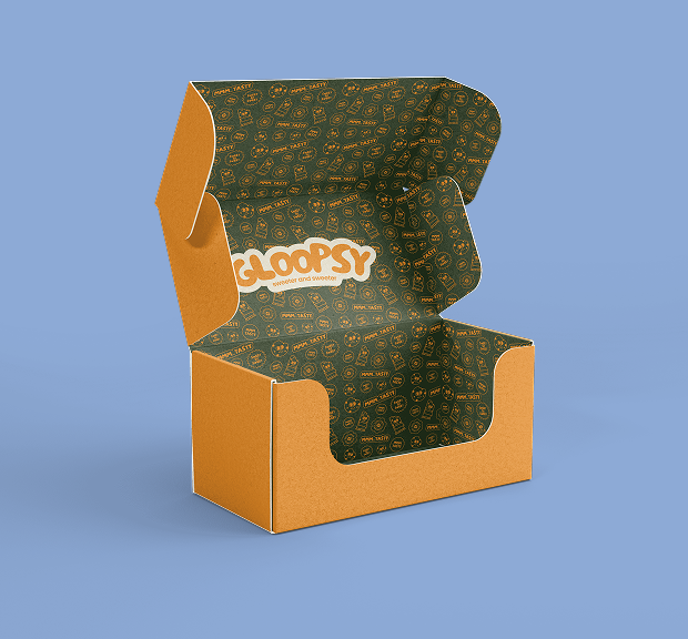
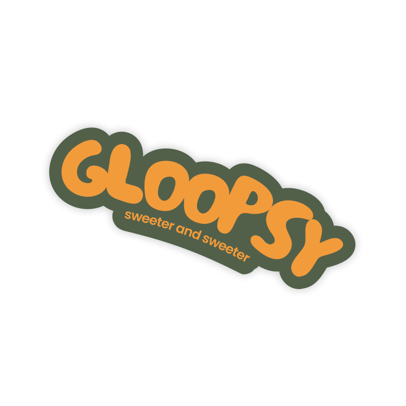
With this project I wanted to create a concept of a company producing healthy, tasty organic cookies and bars created with natural ingredients. This company has playful design with natural but funky color palette and cartoon sticker elements to evoke an inviting and remarkable experience.
Because this was my personal project, I had a chance to enhance my skills in graphic design and marketing. With project brief, I made up the main goal of this company.
From choosing what will the company produce, researching designs of similar already existing companies, choosing the name for this brand, deciding the perfect colour palette and font pairings, to creating the vision of a complex brand identity for Gloopsy.
Constructing a project brief is a big help to create a great marketing and design strategy for something as big as a brand identity.
Logo is an element representing the brand as a whole. So it’s really important to set a process of creating a strong, storytelling logo in 2 or more variations for a good usability across all different media.
For this project I decided to combine a ‘Le petit cochon’ font which in translation means ‘little pig’. This font represents fun and playful personality of this brand.
In both primary and secondary logo I used Le petit cochon, combining it with offset path effect in the primary logo. In secondary logo there is a cookie element representing the goal of the brand which is to produce and sell healthy and tasty organic sweets made of natural ingredients.
In the logo finalizing process I converted the logo sketches to a digital form and created color variations for both logos for better usability across different backgrounds.
Each logo has 4 color variations according to brand color palette. The safe zone of each logo is at a size of a letter G in Le petit cochon font.
The design process itself had some changes to the final outlook. Brainstorming and design thinking took a great part in this process of creating a representative element of this brand identity.
If you are interested into further details about this process of creating logos for Gloopsy,
My task was to create 4 packaging designs for organic cookies and 4 packaging designs for organic bars. Every design is dominating with different brand color depending on it’s flavor.
Each of the designs expresses the fun and playful personality of Gloopsy sweets.
Mockups are a very important part of brand identity, they give clients a great view of the designs in use and help them see how the designs work in real life.
As a brand producing organic sweets, it was a great idea to design a paper bag, a custom box, where you can add your favorite sweets for a better price and a wrapping paper, as different promotional materials.
Every brand, either startup or global, needs a clean and functional website. UI/UX design plays huge part in every business as it is one of the main comunication channels for attracting new clients.
With the same design rules and elements I created a UI/UX design for Gloopsy brand.
To see this process of creating a responsive website for Gloopsy, click here.